OXFAM
Crafting Impactful Visuals for Climate Action: How #inextremis Collaborated with Oxfam on Their Groundbreaking Report
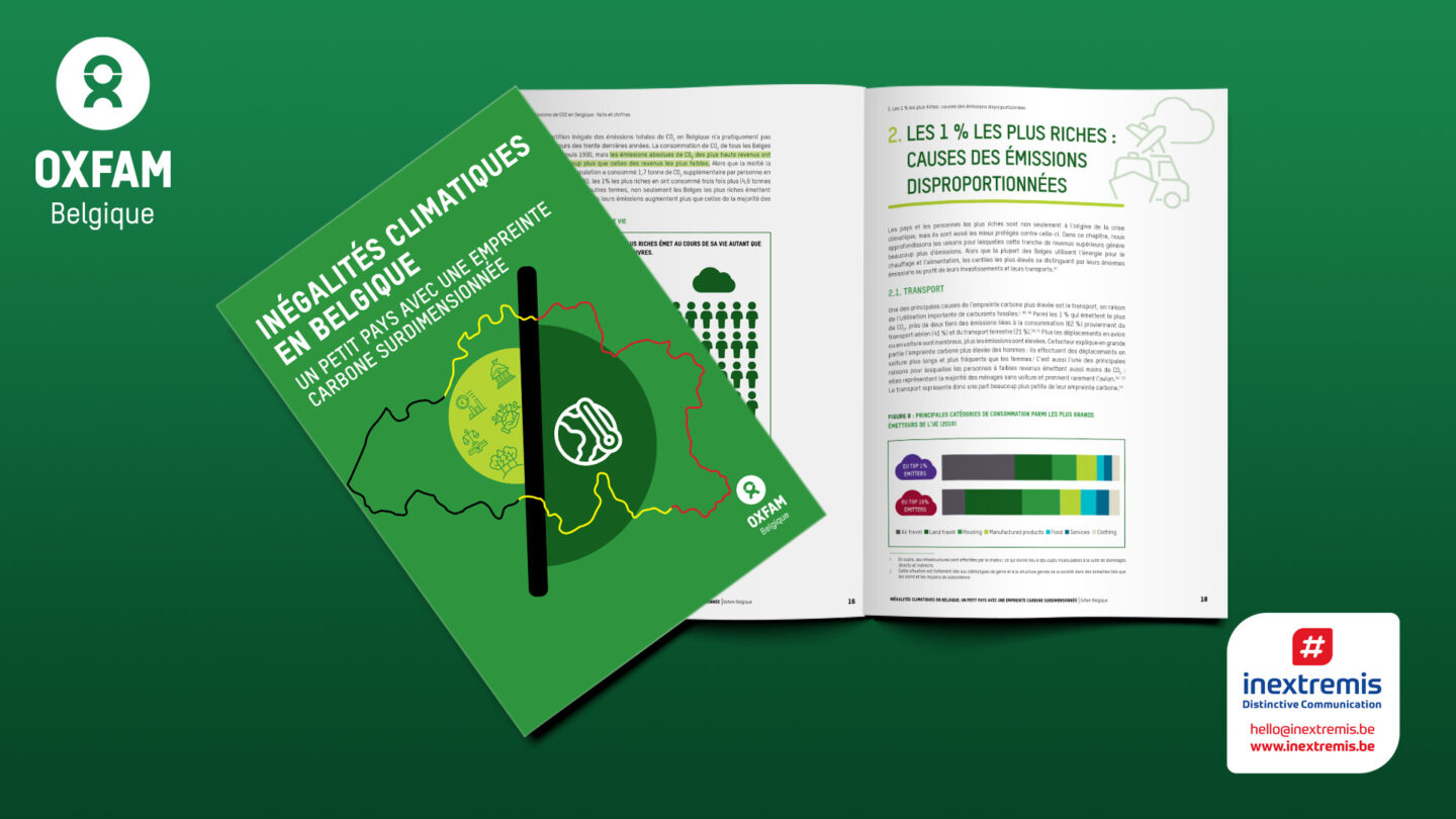
With the climate crisis becoming increasingly urgent, effectively communicating the complex realities of environmental inequality requires more than just words. It demands compelling visuals that convey the data and evoke the urgency and gravity of the situation. This is where #inextremis stepped in, collaborating with Oxfam to create the striking visual identity for their report, “Un petit pays avec une empreinte carbone surdimensionnée”. This project was not just about design; it was about ensuring that the message of climate inequality in Belgium resonated with its audience.
Understanding the Needs of Our Audience
As an agency with extensive experience working with international institutions and European associations, we understand that our audience values clarity, precision, and impactful communication. When Oxfam approached us to design the visuals for their report, our primary goal was to ensure that the graphic design would enhance the readability of the content while maintaining the integrity of the data presented.
The report highlighted critical issues such as the disproportionate impact of the wealthiest 1% on carbon emissions and the intersectional inequalities exacerbating the climate crisis. These topics required an informative and engaging design approach, catering to a diverse audience that includes policymakers, NGOs, and the general public.
The Collaboration Process
Our collaboration with Oxfam’s editorial and communication teams was crucial for the project’s success. From the outset, we worked closely with them to understand their vision and the core messages they wanted to communicate.
We identified the most critical data points that needed visual emphasis. For example, the staggering statistic that the wealthiest 1% in Belgium emit as much CO₂ as the 50% of the population with the lowest incomes needed to stand out. We created infographics that not only highlighted these disparities but also made them easily understandable at a glance.
Structuring the Visual Narrative
The structure of the report was another crucial aspect. We knew that the visual journey through the document needed to be intuitive and flow seamlessly from one section to the next. To achieve this, we employed a consistent colour scheme and typography that aligned with Oxfam’s branding while allowing for the complex data to be presented clearly.
Each section of the report was designed to build on the previous one, guiding the reader through the narrative of climate inequality. For instance, we used stark contrasts to differentiate between the richest and poorest emissions, effectively bringing the data to life.
Examples of Impactful Design Choices
One of the most influential design elements we incorporated was the visual representation of the “carbon budget” depletion among different income groups. By showing how quickly the wealthiest Belgians consume their yearly carbon budget compared to the rest of the population, we helped to visually underscore the urgency of reducing emissions among the highest emitters.
Another example is dynamic charts and graphs that break down complex information into digestible pieces. These visuals were not just add-ons but integral parts of the storytelling, helping to transform abstract numbers into a compelling narrative that drives the call to action.
The Power of Collaboration in Communication
Oxfam’s report’s success is a testament to the power of collaboration between experts in content creation and visual communication.
At #inextremis, we pride ourselves on bringing complex topics to life through design, ensuring that the message reaches and resonates with the intended audience.
In a world where communication is increasingly visual, our partnership with Oxfam highlights the importance of creating designs that do more than complement the text—they elevate it. By working together, we were able to craft a report that informs and inspires action against the pressing issue of climate inequality.
If your organisation wants to create impactful communications that combine a solid visual identity with powerful messaging, #inextremis is here to help. Let’s work together to make your message heard, understood, and acted upon.