EurEau
Crafting Sustainable Logos for European Associations: A Strategic Approach
Creating a logo often falls into the trap of focusing solely on aesthetics. However, a logo is far from just an artistic endeavour; it embodies a strategic asset vital to an organisation’s overall identity.
To fully harness a logo’s potential, two pivotal conditions must be established:
Firstly, a logo serves as a perspective—it symbolises the organisation’s stance towards all its stakeholders.
Secondly, a logo reflects the organisation’s unique personality. This personality is distinct, shaped by more than just the sum of its members or its leadership. Crystallising this distinct identity often requires the expertise of an external consultant.
Before any design work commences, a comprehensive analysis of the organisation’s essence and aspirations is crucial for these foundational conditions to be met.
Once these criteria are satisfied, the resulting logo can maintain its relevance and integrity over time. Take, for instance, our work with Eurogypsum, Eurocommerce, and EurEau—three prominent European associations that have successfully undergone rebranding.
Eurogypsum’s logo, introduced in 2007, represents the gypsum industry at a European level. Combining the industry’s name with two intersecting green shapes, the design highlights the environmental attributes of gypsum, emphasising its 100% recyclability.
EuroCommerce’s logo was designed nearly 14 years ago. It represents the retail and wholesale sectors—a dynamic and crucial part of the European economy. The logo depicts a round table, symbolising equal dialogue among members, with ‘Eurocommerce’ horizontally uniting the circle, reflecting the connection among all parties.
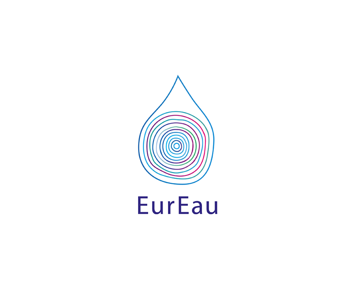
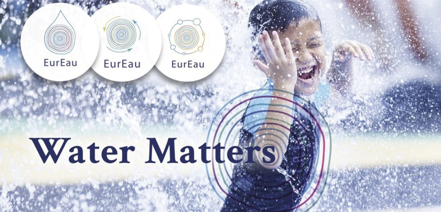
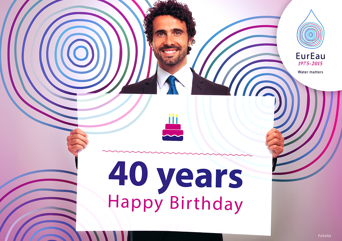
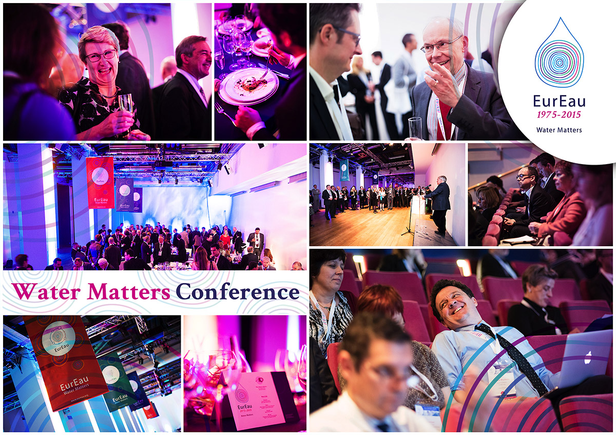
EurEau’s logo, crafted in 2013, stands for national drinking and sanitation services across 29 European countries. The design distils the concept of water to a humanly relatable form—a drop. This is expressed through several circles that hark back to primitive human drawings, with an organic line to underscore water’s vital role in life, complemented by the slogan “Water Matters.”
With over 30 years of experience, #inextremis guides organisations in defining and articulating their uniqueness. Our multidisciplinary team translates your core ideas into intelligent and compelling visual systems. Located in Brussels, #inextremis can assist you in discovering your brand’s core and articulating its distinctiveness within a positive framework of its environment and stakeholders.
At #inextremis, we build brands and fortify reputations for leading organisations, European associations, and corporations, shaping brand identities that resonate and endure.