In the dynamic world of financial markets, the European Securities and Markets Authority (ESMA) embarked on a transformative journey to revamp its brand identity and better reflect its evolving role in fostering stable, orderly financial markets and enhancing investor protection. This study case delves into ESMA’s comprehensive rebranding process, offering valuable insight to communication directors of European associations and beyond. Discover a blueprint for successful brand evolution in the face of technological innovation and sustainability challenges.
This rebranding journey began with a critical assessment of ESMA’s existing brand identity. The aim was to modernise its image and more accurately communicate its values and objectives. Below, find the distinct phases designed to ensure the new brand identity resonated with internal and external stakeholders, without straying from ESMA’s core mission.
An exhaustive evaluation that involved internal and external surveys, visual analysis, and identifying strategic gaps, to better set the stage for reinvention.
By defining target groups, brand architecture, positioning, and personality, ESMA laid the groundwork for its new identity, ideally aligned with its strategic vision for 2023 – 2028.
The development of a new logo and refreshed brand aesthetic marked a key moment in ESMA’s rebranding, communicating its commitment to accessibility and credibility as a regulator in the financial market landscape.
With new brand guidelines, ESMA rolled out updated communication material and launched targeted social media campaigns, effectively engaging its audience with the new brand identity.
Monitoring the reception and impact of the rebranding efforts allowed ESMA to fine-tune its approach and ensure the new identity met its strategic objectives and resonated with its audience.
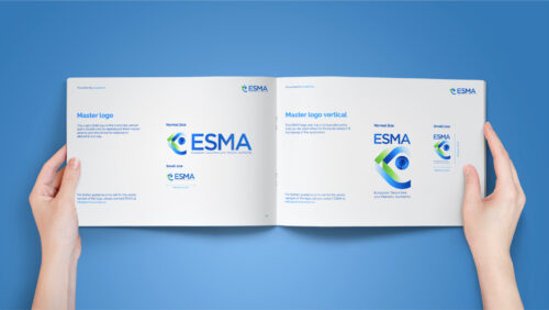
The new ESMA visual identity guidelines ensured consistency across all communications and represented a cornerstone during the rebranding. They can be broken down as follows:
The guidelines’ introduction stresses the importance of coherence in ESMA’s material and explicitly prohibits unauthorised logos or identities.
The guidelines further detail the new logo, colour schemes, typography, and imagery, all designed to reflect ESMA’s focus on sustainability and technological innovation.
Specific directives for the creation of various communication materials, from business cards to digital content, emphasise the importance of embodying ESMA’s renewed brand ethos across every touchpoint.
This case study of ESMA’s rebranding journey stresses the importance of a systematic, inclusive approach in redefining a brand’s identity. The position of ESMA as a modern regulator attuned to the needs of its stakeholders and the demands of a rapidly evolving market environment was contingent on the meticulous implementation of each phase. From audit to impact evaluation, without forgetting the adherence to comprehensive visual identity guidelines, the correlation between this streamlined process and success cannot be understated.
For communication directors and managers within European associations and beyond, ESMA’s journey offers a compelling model of how strategic foresight, coupled with creative execution, can lead to a revitalised brand identity and effectively communicate core values and objectives. Clear guidelines, stakeholder engagement, and the willingness to adapt based on feedback provide a solid roadmap for any organisation looking to navigate the complexities of brand transformation in today’s digital age.