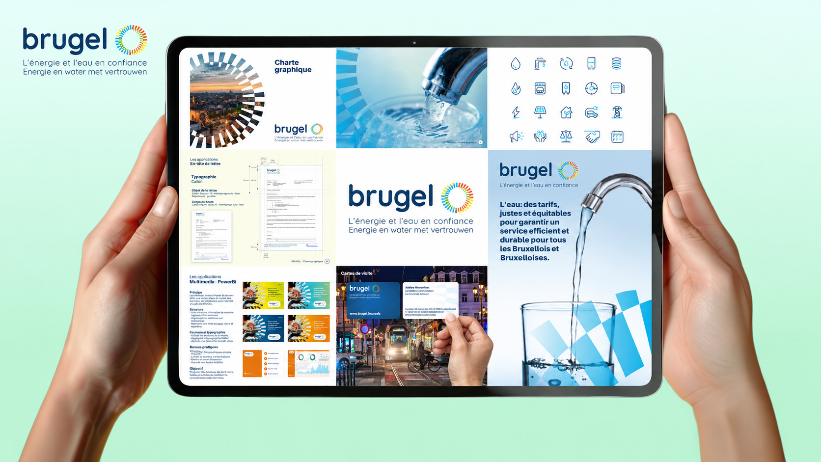
BRUGEL’s brand guide makes that challenge tangible.
Its segmented circular symbol extends into the wider visual identity. Enlarged and cropped, it frames photographs and shapes compositions across the examples shown in the guide.
That gives the identity a visual thread beyond the placement of a logo.
The language choices follow the same logic. French, Dutch and bilingual versions of the signature share a common construction, with energy and water brought together in the brand’s promise.
Then the guide moves into everyday use.
It sets out typographic roles, clear space around the logo and ways to handle photographic backgrounds. It carries those decisions into presentations, studies, press releases, newsletters and email signatures.
For communication teams, this is where branding becomes practical: the guide addresses the documents people regularly need to produce.
One particularly useful detail comes towards the end. The publication guidelines distinguish what must remain consistent from what designers can adapt.
Typography, colour and hierarchy provide continuity. Orientation, columns, image treatments and spacing can respond to the content.
That balance deserves attention. Communication leaders need an identity with enough definition to guide decisions and enough flexibility to accommodate different subjects, formats and levels of detail.
BRUGEL’s guide gives that balance a concrete expression.