
EUROPEAN ASSOCIATION · BRAND STRATEGY AND EVOLUTION
From a new name to a mature brand: APPLiA’s evolution in two planned stages.
A new name was the beginning of APPLiA’s brand journey. Working with its team, #inextremis planned two stages: establishing the brand in 2019, then developing its maturity in 2023 through a new website, a darker blue identity and two clear pillars.
At a glance
- Client
- APPLiA — Home Appliance Europe
- Context
- A European association moving from an administrative identity towards a more fully expressed corporate brand
- Challenge
- Establish a new brand and plan how it would evolve as it matured
- Contribution
- Brand strategy developed with the APPLiA team, naming and complete branding in 2019; brand evolution and a new website in 2023
- Guiding idea
- A brand is a living organisation’s expression: it needs room to evolve over time
The challenge
Plan for the brand’s growth from the beginning.
The change from CECED to APPLiA called for more than a new name and logo. It was an opportunity to move beyond an administrative identity and give the association a clearer corporate expression.
From the outset, we planned the work in two periods. The first would establish the new brand. The second would develop that foundation into a more mature corporate identity. Evolution was part of the original plan.
2019 — Establishing the new brand
Define the strategy together, then give it a name and an identity.
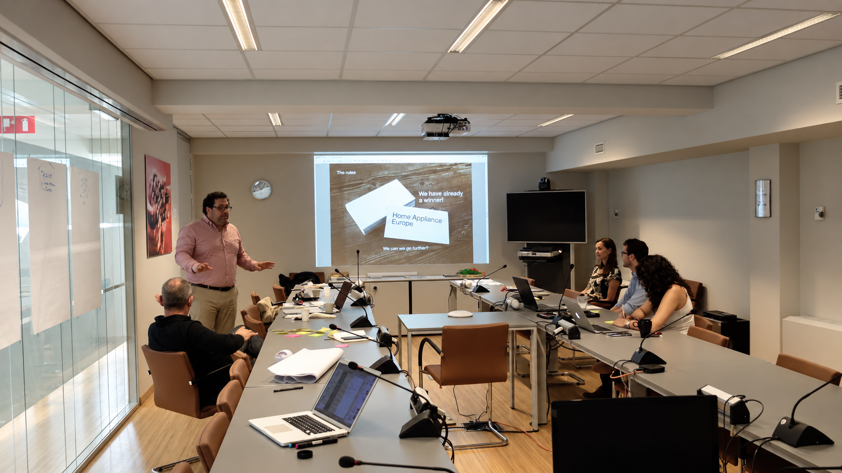
We worked with the APPLiA team to define the brand strategy before developing the new name and complete branding. This first stage established APPLiA as a brand with its own corporate expression.
The identity was conceived as a starting point for continued development. Planning a later update created space for the brand to grow while retaining continuity with its beginnings.
2023 — Expressing maturity
A more assertive identity, a new website and two clear pillars.
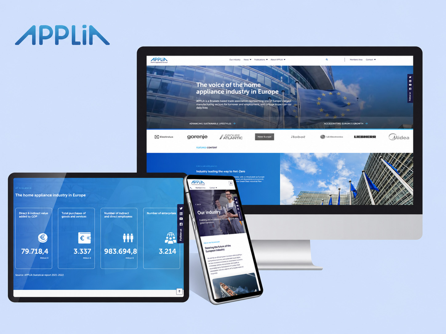
The second stage brought a new website and a change in the logo’s colour, from light blue to dark blue. This was a deliberate expression of the brand’s maturity.
The brand’s focus was centred on two pillars:
- 01
Advancing sustainable lifestyles
- 02
Accelerating Europe’s growth
Together, these pillars gave the brand two clear themes around which to express the association’s role. The website and updated visual identity formed part of the same planned stage of development.
Why the two-stage approach mattered
Continuity gave the change its meaning.
A brand evolves with the organisation it represents. For APPLiA, planning that evolution meant that the 2023 update could build on the identity established in 2019.
The darker blue, new website and two pillars belonged to one progression: from the birth of a new brand towards a more fully expressed corporate identity. The value of the approach lies in connecting these decisions over time.
What the work delivered
A brand developed across two planned stages.
- 01
A brand strategy defined with the APPLiA team.
- 02
A new name and complete branding in 2019.
- 03
A planned step towards maturity in 2023, including a new website and a darker blue logo.
- 04
A focus on sustainable lifestyles and Europe’s growth.
What should the next stage of your brand express?
We can work with your team to clarify what needs to evolve, what should remain recognisable and how brand strategy, identity and digital presence can develop together.
Continue